Designing a social search engine for places
In the post-2010 era of SoLoMo (Social-Local-Mobile) products, Spotsetter emerged as a unique social search engine for places. This case study delves into the design process behind the Spotsetter app, highlighting the challenges faced, solutions implemented, and the ultimate impact on user experience.

Background
Spotsetter's core product was designed to deliver personalized venue recommendations based on users' social media data from Facebook, Instagram, Foursquare, and Twitter. This private data, combined with publicly scraped reviews from over 30 sites, formed the foundation of our recommendation engine.
My role
As the sole designer in a six-person startup, I collaborated closely with the VP of Product to drive all aspects of the design process, from research and prototyping to final delivery.
Challenges (Part 1)
Early-stage startups face numerous challenges, but three key issues stood out:
Creating a unique UI/UX in the crowded SoLoMo landscape.
Strategically prioritizing and presenting private and public data to users.
Transforming less engaging data into valuable insights.
Design solutions
To address issue #1, I focused on the product's main value: delivering a personalized experience. Here are some unique user experiences I created through layout and interaction design.
Unique search experience:
I noticed that having just a text box over a map or needing to type in a search bar didn’t match the lifestyle of people in downtown San Francisco. I was also inspired by products like Google Now, which anticipated user needs.

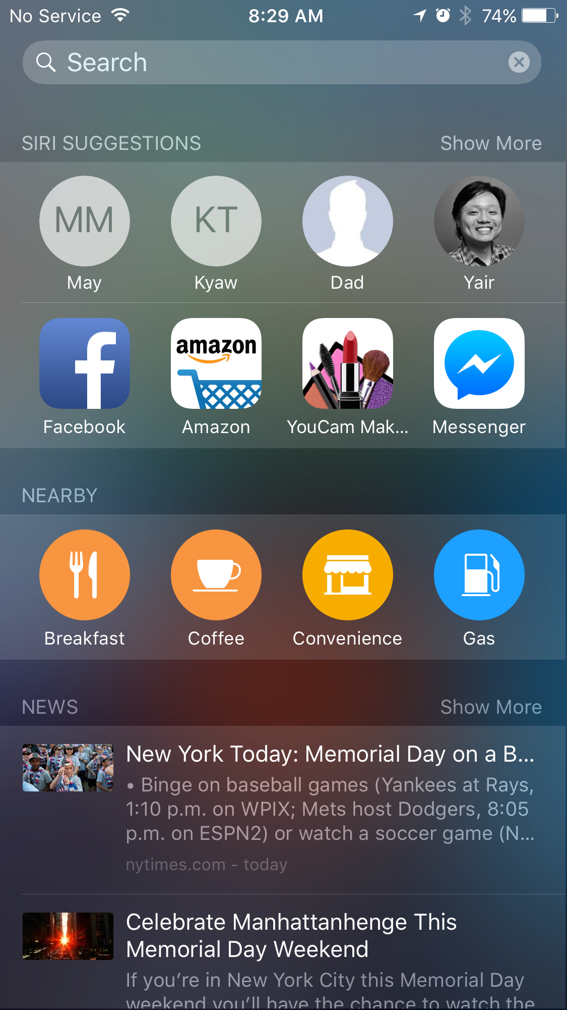
Personalized home:
Backgrounds dynamically changed based on location, with relevant quick search icons.
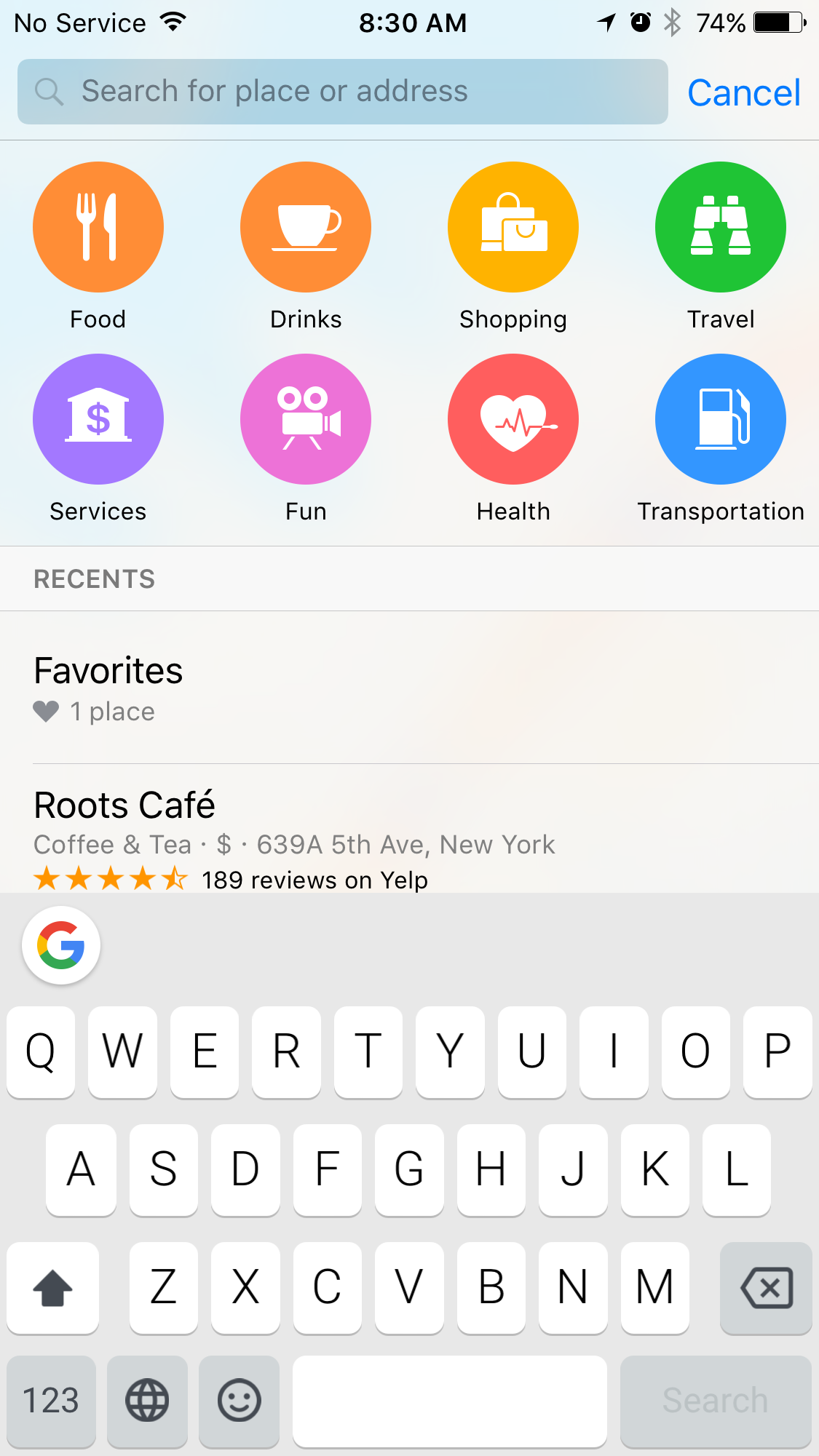
Search suggestions:
Recent searches appeared as colorful icons for rapid access.

Results:
Spotsetter's logo pin marked results on the map, reinforcing brand identity.

Split view:
A unique data presentation that was highly praised by users.
Venue details view
To address issue #2, I created 8 versions over 4 months and conducted 3 rounds of user testing to finalize this view. I had to use various types of venue data to ensure users received clear decision-making indicators. When done correctly, less can mean more.

Private data:
Friends' visit history served as a key decision-making factor.
Labeling Friends with Skills:
New users begin with a quick tutorial to tag trusted friends.


Valuable public data:
Frequently used terms from Foursquare provided additional context.

Suggestion View
The suggestion card shows how often this friend was tagged and the places they visited.

In-depth Public Review:
Both critic and crowd-sourced reviews were incorporated.

Public info:
Spotsetter was the first to display "opening soon" and "closing soon" info.
Empowering users
For issue #3, we believed that our users’ know who their friends and what they like. We implemented a system where users could tag friends as experts in specific categories, leveraging their social data to refine recommendations further.


Visited Places
This view shows why we think these places are highly rated and recommended to our friend.

Flash Recommendations
After tagging friends, users will see suggestions for the categories of those tags.
Challenges (Part 2)
Our initial launch of Spotsetter was promising, with 15,000 weekly active users and steady organic growth. However, a glaring issue emerged: only 42% of users returned to the app after their first experience. A deeper dive revealed the culprit: users weren't coming back after their personalized data was ready. But why?
The data dilemma
Spotsetter's magic lay in its personalized recommendations, powered by users' social data. We collected vast amounts of location-based information, but this process took 4-5 days to complete. While we had optimized it to just an hour, we underestimated the impact of this delay on user behavior.
Design solution
As the UX designer, I took this challenge personally. After extensive research and analysis, I discovered a key flaw in our expertise tagging process. We had unintentionally created an illusion of mandatory steps, leading users to fill all eight slots even when not required.
This revelation inspired a complete overhaul of our First-Time User Experience (FTUE). We replaced vague instructions with clear, concise messaging and visual cues. A prominent progress bar guided users through each step, creating a sense of accomplishment and reducing drop-off.


We strategically timed permission requests to maximize user understanding and acceptance. During the data processing wait, users could connect additional social networks to further enhance their recommendations. Upon completion, a personalized welcome screen reinforced the app's value proposition.


The Turnaround
The redesigned FTUE led to a remarkable turnaround. First-time user activation surged to 78%, and notification opt-in rates soared to 82%. Users were finally experiencing the true power of Spotsetter's personalized recommendations.
Conclusion
Since Spotsetter’s news started to spread across Silicon Valley, we started to get offers from different companies and on June 2014, we were acquired by Apple for our technology. It was a huge win for us, our investors, and our customers since our product will now live inside Apple Maps.
A year after the acquisition, iOS was updated and I started to see something familiar from my design not just inside Apple Maps but also on iOS search. It was our signature quick search colorful icons.


